Keke’s Breakfast Cafe

Landing page design and reusable component system for Keke’s Fall 2025 seasonal menu, with AI‑assisted iconography and faster speed‑to‑market.

Client
Keke's Breakfast Cafe
Date
2025
Role
Lead UX/UI Designer & Design System Lead
The Design Process
Understanding The Challenge
Research
Interviews
Empathy Maps
User Personas
Competitive Analysis
Accessibility Compliance Ā 
Ideation & Lo-fi Design
User Flows
Information Architecture
Paper Wireframes & Testing
Hi-fi Design
Visual Design
Interaction Design
Motion Design
Evaluation & Iteration
Figma Prototype
Collaboration Boards
Testing
Last UI ChangesĀ 
Documentation
Bussiness Challenge
• Promote the Fall 2025 menu with strong above‑the‑fold impact and clear CTAs.
ā€
• Reduce production time for seasonal refreshes via reusable components and iconography.
ā€
• Ensure on‑brand visuals while accelerating asset creation with AI (then refined in Illustrator/Photoshop).
Goals & Objectives
Drive menu exploration and ordering from the seasonal landing page while reducing design/production time for future seasonal pages.
Pain Points
Discovering and ordering new seasonal menu options easily
Information architecture
•⁠  ⁠Structure content for scanning short blocks, clear headings, concise copy with strong CTA hierarchy.
ā€Data Hierarchy and Organization: Organized data into a hierarchical structure to prioritize key metrics and facilitate easy navigation.
ā€Wireframes and Low-Fidelity Prototypes: Developed wireframes and low-fidelity prototypes to outline the dashboard layout and user flow.
Design System
- Reusable Figma components library
- Tokens for typography, color & spacing
- Robust Documentation
Parameters

Usability Study

Study Type
Unmoderated usability study
Location
United States, Remote
Participants
5 Participants
Length
20 to 30 min
Key Findings About Users and Their Needs
Above-the-fold clarity increased perceived relevance; users preferred a single, prominent CTA.
User Personas
Created personas representing returning and new users
User Journey Maps
Mapped the user journey to identify pain points and opportunities for reducing friction

Final Solution

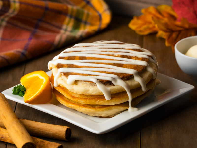
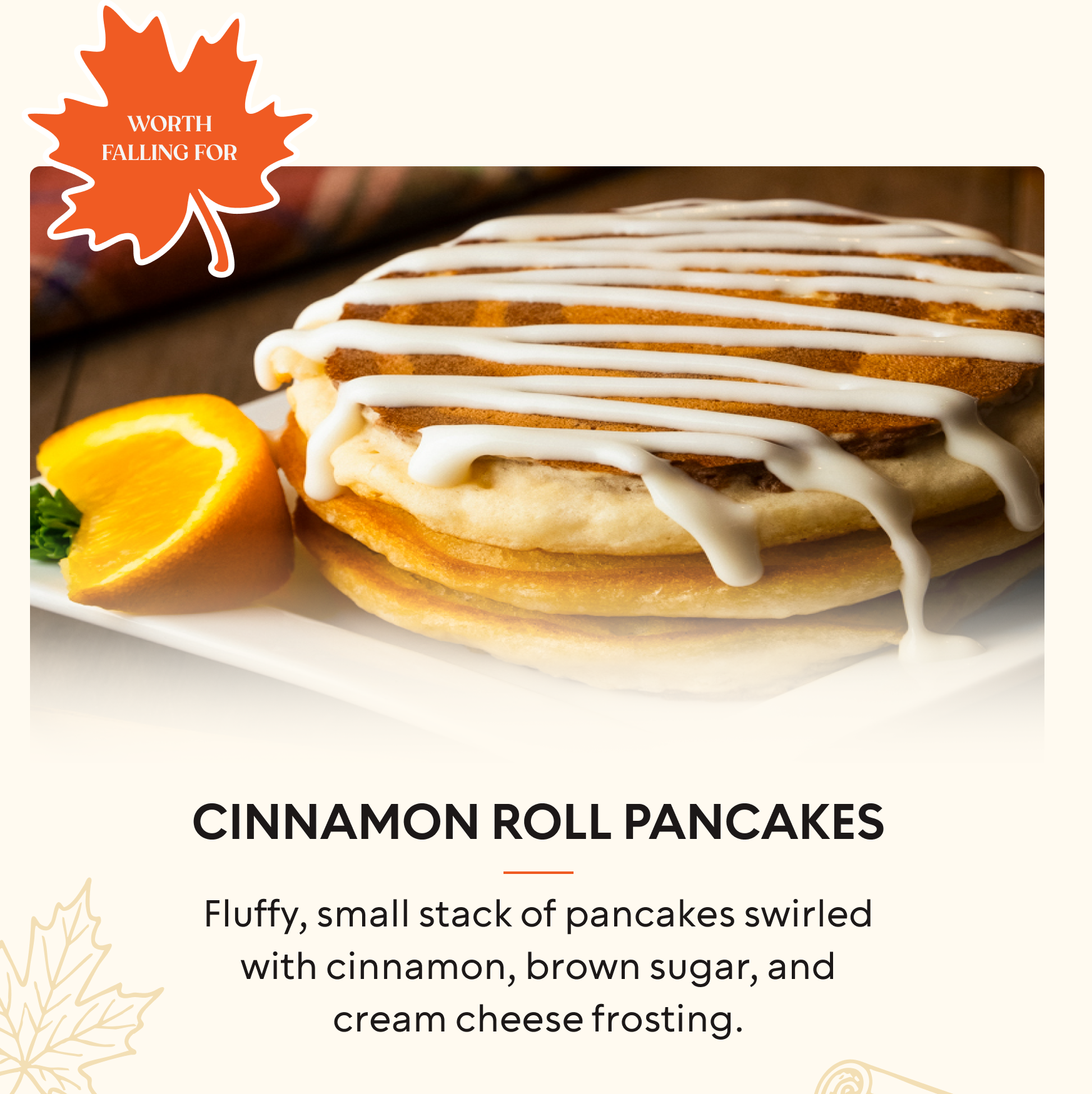
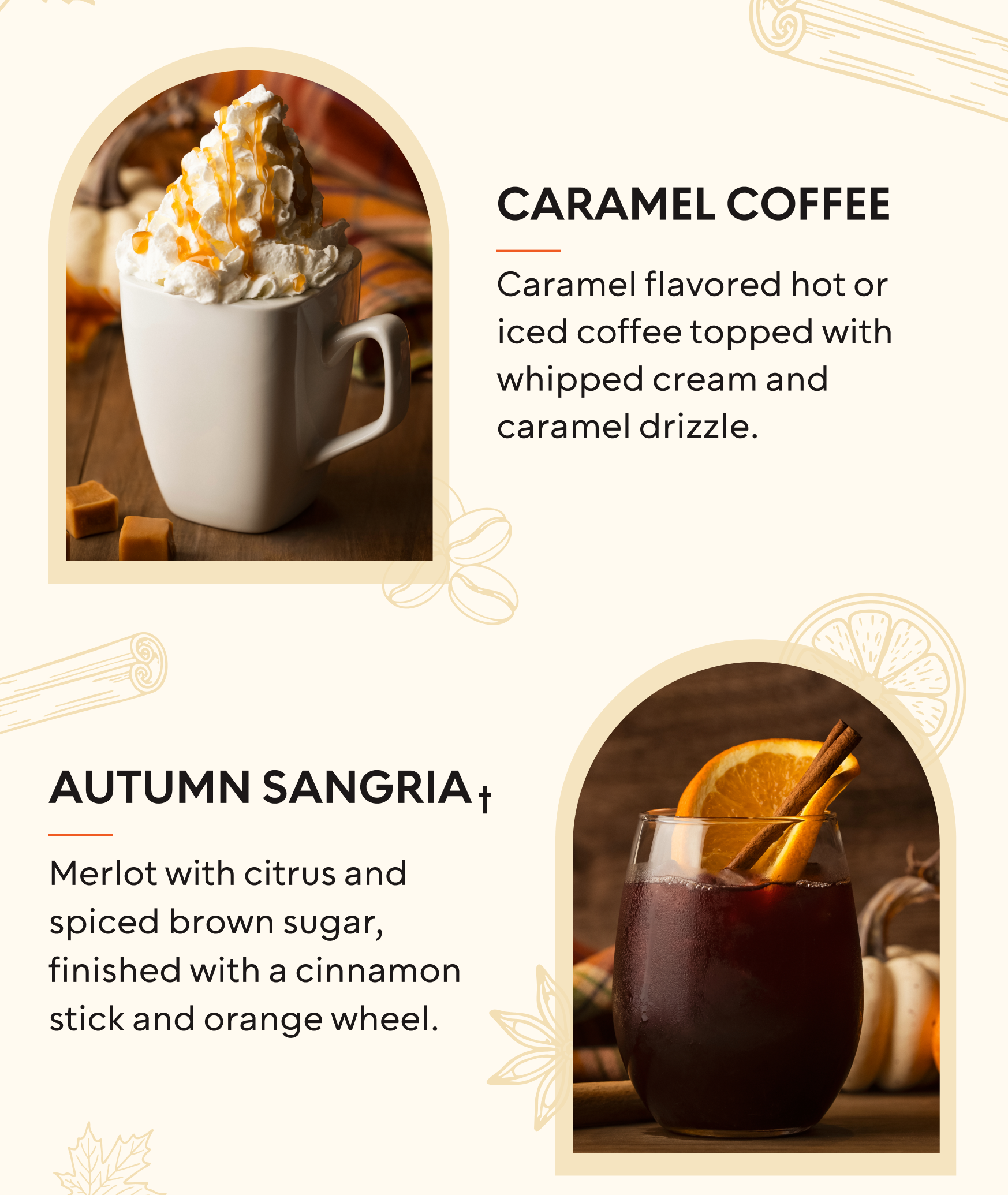
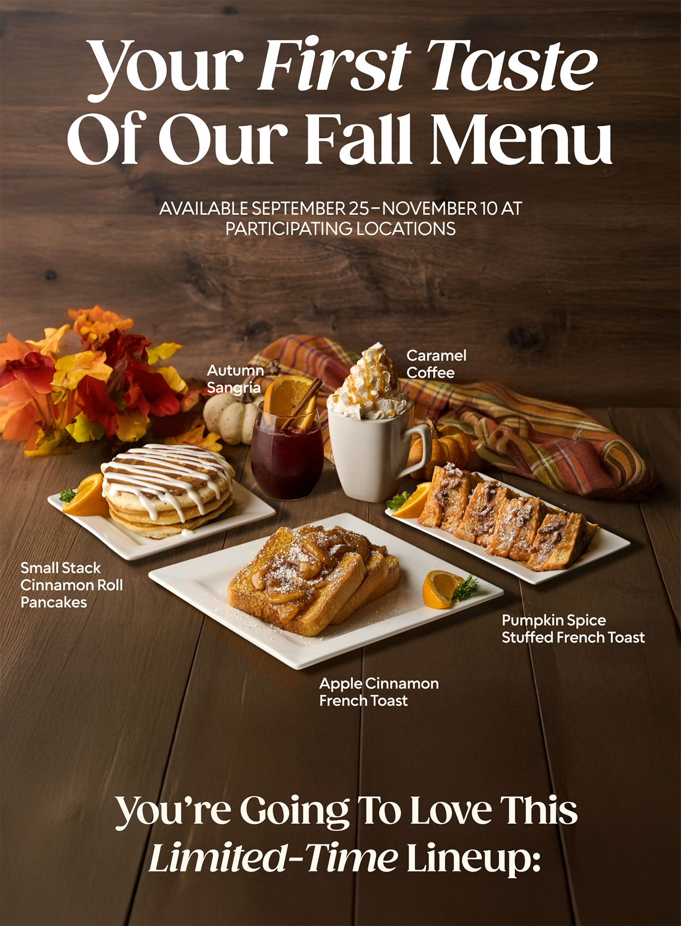
A seasonal landing page with a high-impact hero and modular sections, powered by a reusable design system. Custom AI-assisted icons and imagery align with brand while reducing production time.
Results & Impact

Metrics and KPIs
• CTR to menu items
• Clicks to Order
• Production efficiency
• Performance guardrails: LCP ≤ 2.5s; CLS ≤ 0.1; INP < 200 ms.
User Feedback
- Above‑the‑fold clarity increased perceived relevance; users preferred a single, prominent CTA.
ā€
- Minimal iconography improved quick scanning versus dense icon sets.
ā€
-Adopt single primary CTA; simplify copy; refine icon set for legibility on mobile.
Business Outcomes
• CTR to menu items:+18%.

• Clicks to Order: -23%.
ā€
• Production efficiency: Reduce creative turnaround time by ≄30% vs. prior season.
ā€

Lessons Learned

Clear above-the-fold value prop and single CTA reduce indecision.
Modular design accelerates seasonal refreshes without sacrificing quality.
AI can speed ideation; human refinement ensures brand fidelity.

Conclusion

Project Achievements

Successfully created performant landing page, created scalable design system in Figma. Used generative AI to create custom icons and UI elements

What I Learned

Gained valuable experience in data visualization, user interface design, and the importance of iterative user feedback in creating effective design solutions.