Emory University Epidemiology Labs

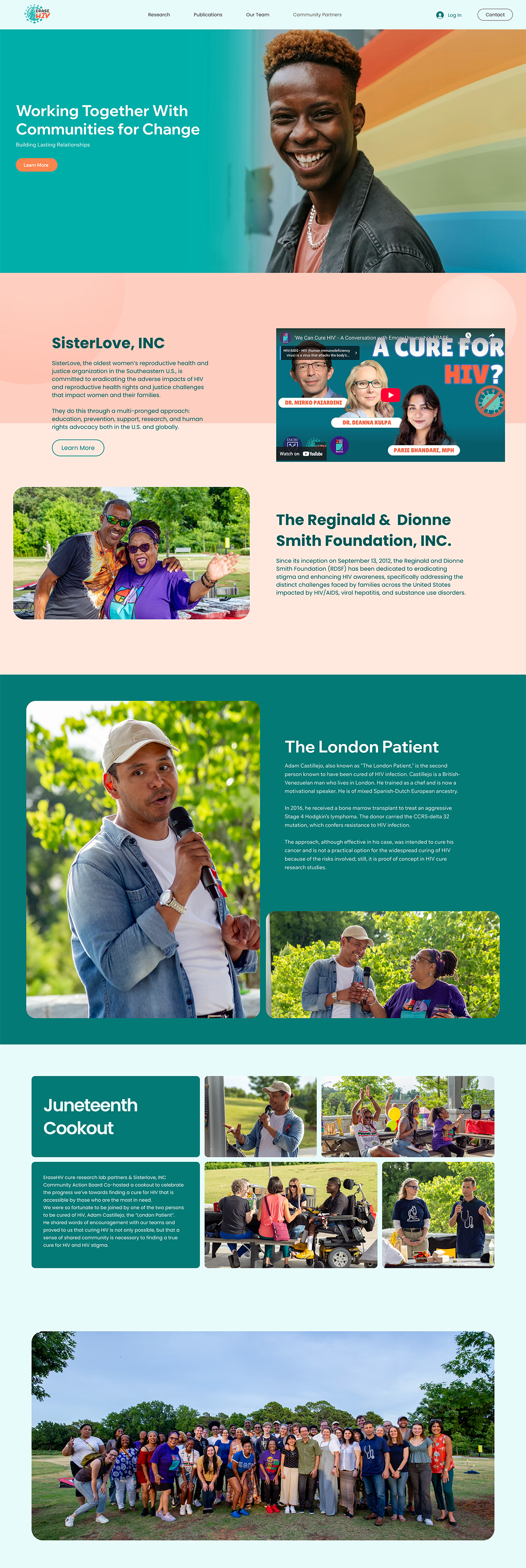
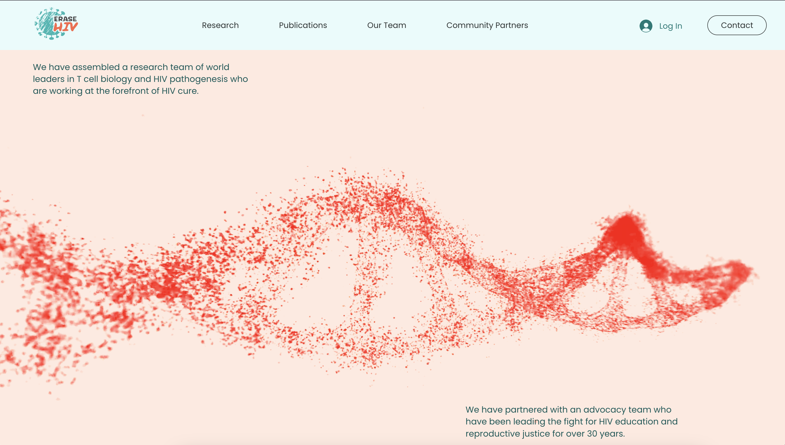
Two Emory University HIV/STI research lab websites built on Wix Studio with a reusable design system, scannable content, and WCAG 2.2 AA—optimized for publications, CAB partners, and Core Web Vitals.

Dual Lab Websites for HIV/STI Research and Community Engagement

I led strategy, IA, UX/UI, motion, design system, and front‑end implementation. We built a component‑based system in Figma, validated content with unmoderated studies and interviews, and launched two performant, accessible sites with plain‑language content, structured publications, and CAB storytelling. Post‑launch measurement was planned around awareness and findability; success targets and validation plans are defined below (where baselines did not exist pre‑launch).
Client
Emory University
Date
2021 -  2025
Role
Lead UX/UI Designer
The Design Process
Understanding The Challenge
Research
Interviews
Empathy Maps
User Personas
Competitive Analysis
Accessibility Compliance  
Ideation & Lo-fi Design
Paper Sketching
User Flows
Information Architecture
Paper Wireframes & Testing
Hi-fi Design
Visual Design
Interaction Design
Motion Design
Evaluation & Iteration
Figma Prototype
Collaboration Boards
Testing
Last UI Changes 
Documentation
Bussiness Challenge
• Raise awareness among peers and funders.• Present publications, people, and research themes clearly.

• Highlight CAB partnerships in accessible, non‑jargon content for non‑academic partners.

• Be easy for lab staff to update in Wix Studio without developer support.
Goals & Objectives
Increase brand awareness and content discoverability for each lab.

Target KPIs:

- Direct/referral sessions (monthly): from [Baseline: none; new build] to [Suggested target: 1,200+/lab by Day 90], driven by .edu/.gov/.org referrals. Validation: GA4 90-day post-launch report with source/medium segmentation.
‍
- Publications engagement rate (clicks to publications per session): from [Baseline: n/a] to [Suggested target: ≥35%]. Validation: GA4 event tracking.

-Findability (task success for “Find latest publications” and “Find CAB partners”): from [Baseline: Suggested 62% via pre-launch prototype test] to [Target: ≥80%]. Validation: unmoderated task test (n=12) and first-click analysis.

- Performance: LCP ≤ 2.5s; INP < 200 ms; CLS ≤ 0.1 at p75 (mobile and desktop). Validation: PageSpeed Insights + CrUX in Search Console. (Benchmarks verified November 7, 2025.)
Pain Points
- Keeping up to date with research developments and community activities.
- Lacking single source of truth for the research labs
Execution Channel Workstreams
UX/IA and ContentTactics: card-sorting, sitemap and labeled navigation (“Publications,” “Research,” “People,” “Community”), scannable pages using bullets and descriptive H2/H3s; CAB pages with partner logos and plain-language FAQs aligned to CDC CCI.

Accessibility checks for contrast, focus, and error states; keyboard order verified. Tools: Figma + plugins (Able, Stark).UI & MotionTactics: subtle Lottie accents; CSS transforms/opacity animations only; reduced motion preference respected. Tools: Lottie, web.dev animation guidance.

Front-End & CMS (Wix Studio)Tactics: CMS collections for Publications, People, CAB partners; dynamic pages; schema enhancements (Article); image optimization (WebP), lazy loading, font-display swap. Tools: Wix Studio, Search Console.

Performance & Analytics Tactics: Core Web Vitals guardrails (LCP/INP/CLS); trim third-party scripts; GA4 event model for publications and CAB clicks; Search Console verification.

AccessibilityTactics: WCAG 2.2 AA checklist (labels, focus order, error prevention, redundant entry); alt text policy for photography.
Parameters

Usability Study

Study Type
Quick unmoderated tests of wireframes and hero variants; mobile emphasis.
Location
United States, Remote
Participants
5 Participants
Length
20 to 30 min
Key Findings About Users and Their Needs
- Publications first: Researchers wanted direct paths to publications and datasets; long PDF lists and jargon reduced trust and scanning speed.

- Plain-language summaries and HTML pages were preferred.CAB clarity: CBO partners needed jargon-free descriptions of CAB purpose, membership, and impact, with photos and simple “How to partner” calls to action.

- Navigation signal matters: Initial-click accuracy strongly predicted task success; labeling “Research,” “Publications,” and “Community” reduced pogo-sticking.
‍
User Personas
Public health researchers (academic and government), public health administrators, and leaders at community‑based organizations.
User Journey Maps
Mapped the user journey to identify pain points and opportunities for improvement.

Final Solution

Two independent lab sites with a shared design system:

  • Information architecture centered on four primary paths (Research, Publications, People, CAB).
  • Scannable content and plain-language intros on every section.
  • Publication library powered by Wix CMS collections with Article structured data for better parsing and previews.
  • Laboratory-inspired visual style using subtle glassmorphism on cards (maintaining contrast requirements) and lightweight Lottie accents adhering to high-performance animation guidance.
  • Accessible, performant front-end with Core Web Vitals targets and WCAG 2.2 AA checks.

Results & Impact

Metrics and KPIs
• Direct/referral sessions (monthly)
• Publications engagement rate
• Findability (task success for “Find latest publications.
• Performance
User Feedback
The new sites finally reflect the scope of our work and make it easy for partners to find publications and CAB information.
Business Outcomes
• Direct/referral sessions (monthly): Baseline none (new build) → Target 1,200+/lab by Day 90; validate in GA4.
‍
• Publications engagement rate: Baseline n/a → Target ≥35%; GA4 events.
‍
• Findability (task success for “Find latest publications”, “Find CAB partners”): Baseline 62% (prototype) → Target ≥80%; unmoderated test n=12.

• Performance: LCP ≤ 2.5s; INP < 200 ms; CLS ≤ 0.1 at p75; PSI + CrUX.

Lessons Learned

Language drives trust:
Applying plain-language and scannable structure improved comprehension for both expert and community audiences.
Label clarity beats cleverness:
Descriptive nav labels increased initial-click success and reduced detours.
Motion must be purposeful:
Subtle, performant animations (transform/opacity) add polish without harming INP.

Conclusion

Project Achievements

Successfully transformed complex data into an intuitive and useful dashboard, significantly improving data clarity and user engagement.

What I Learned

Gained valuable experience in data visualization, user interface design, and the importance of iterative user feedback in creating effective design solutions.